4 more spots left for q4
Elevating an AI platform with a sharper, more premium website redesign
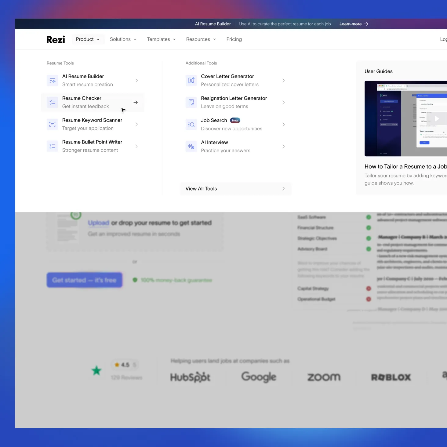
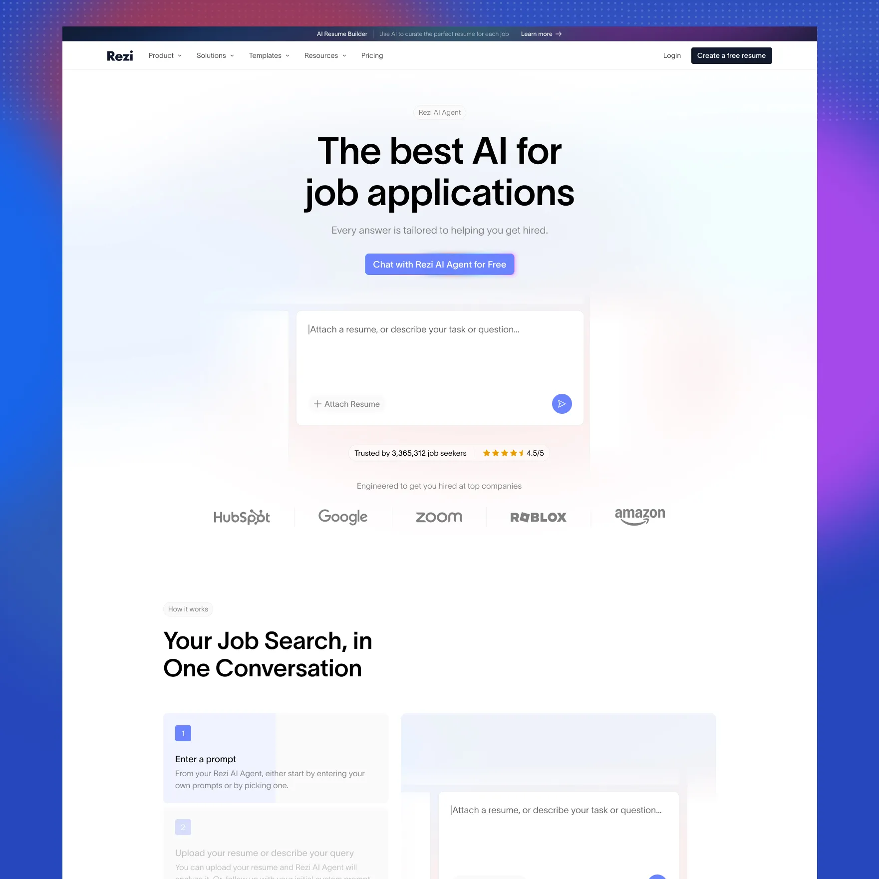
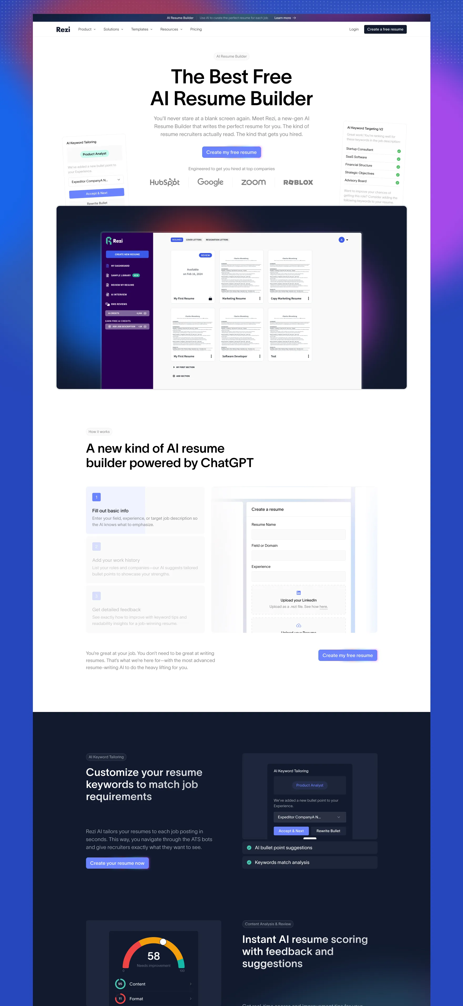
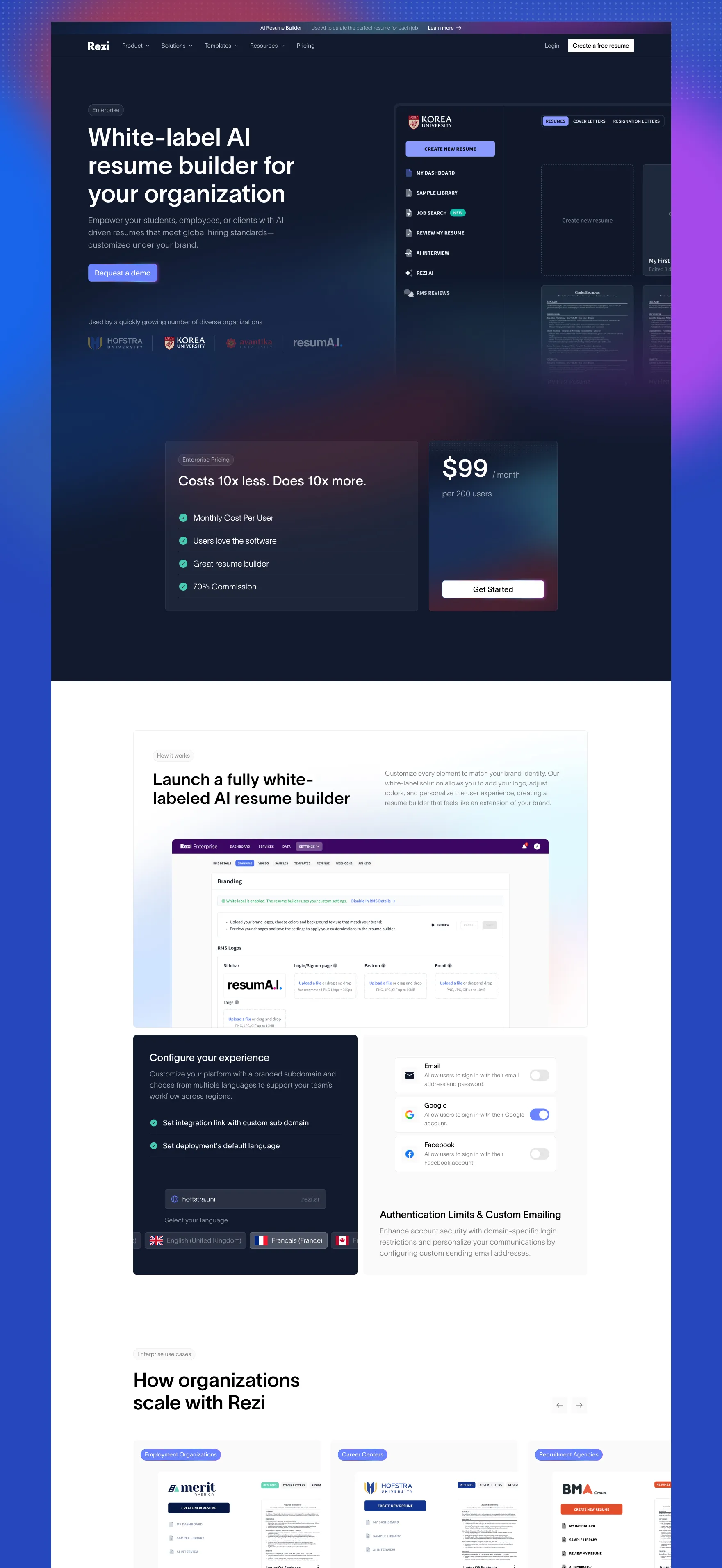
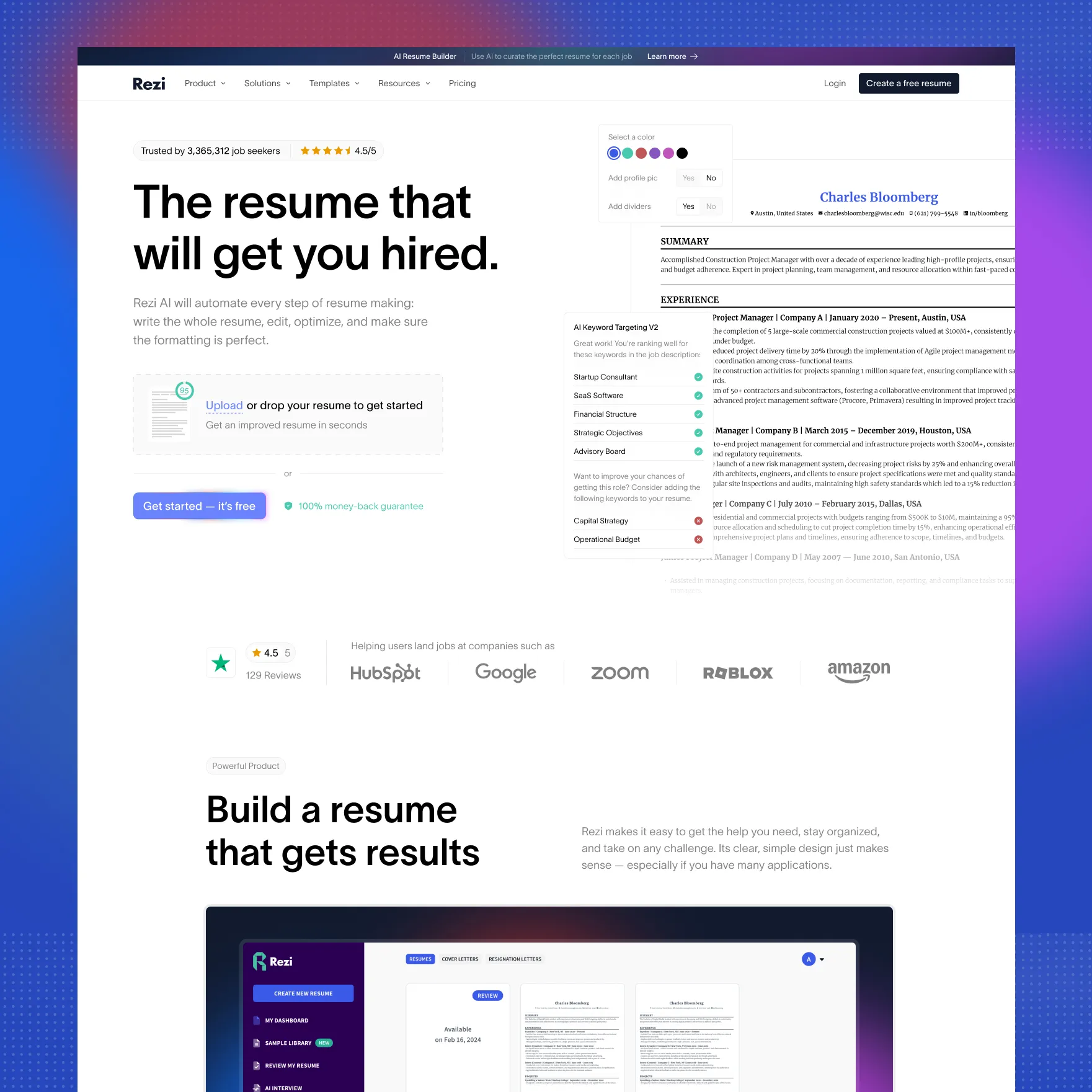
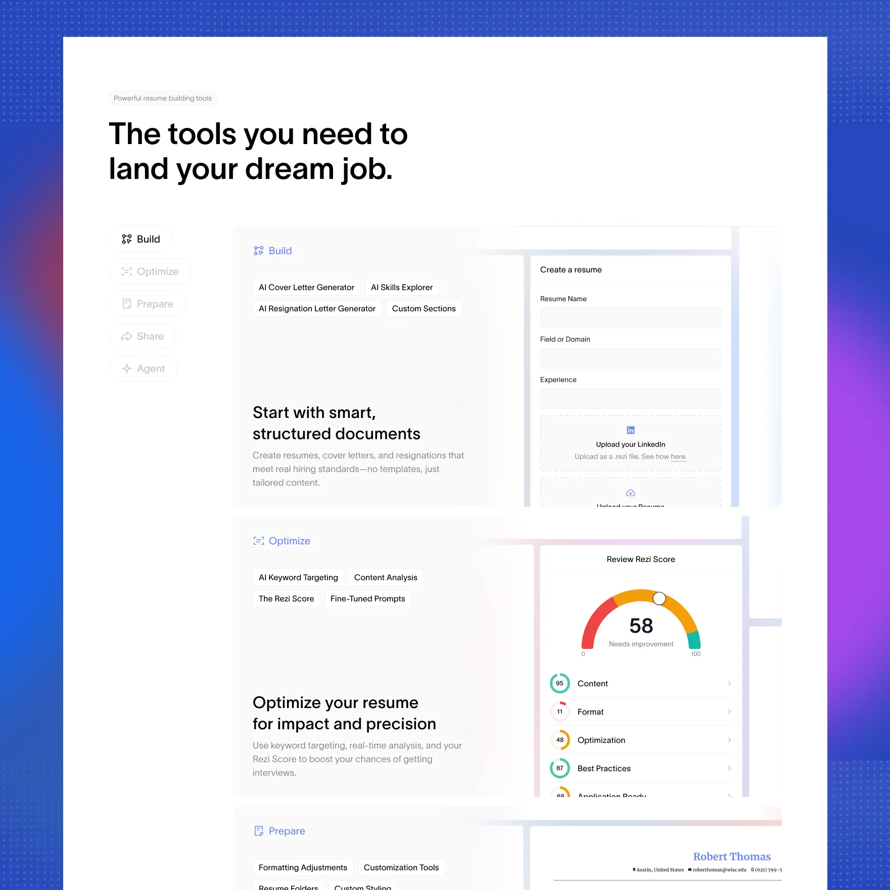
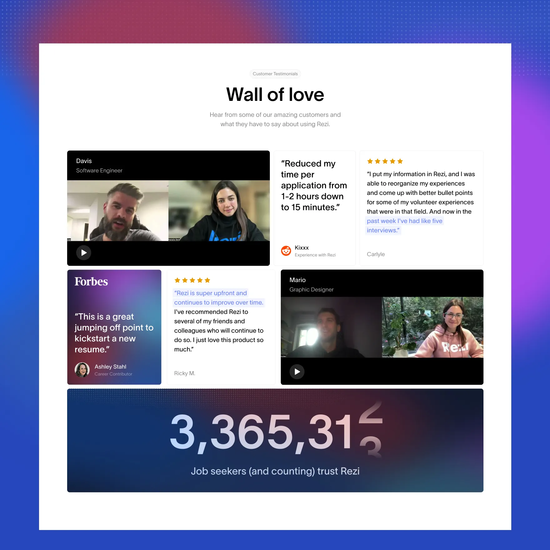
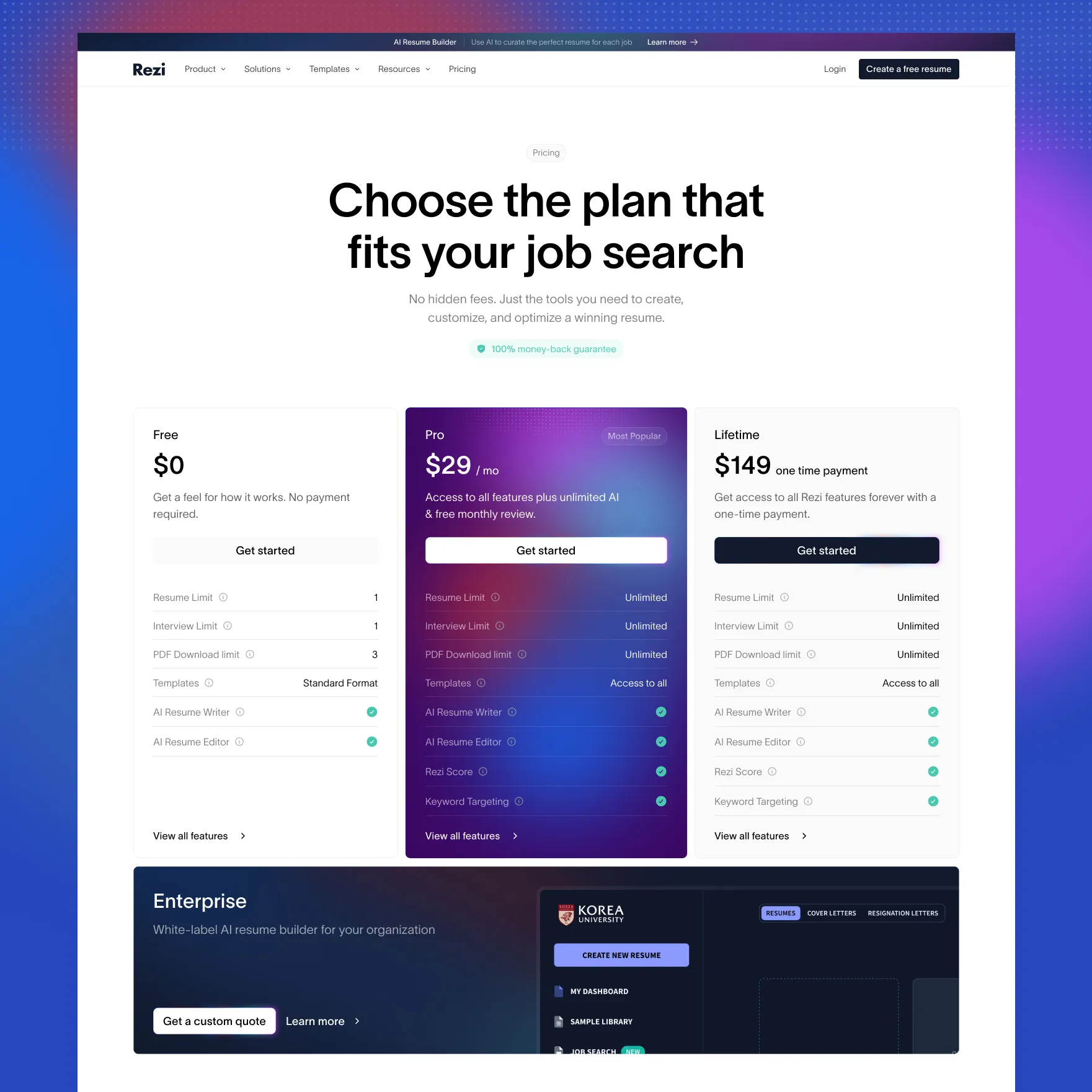
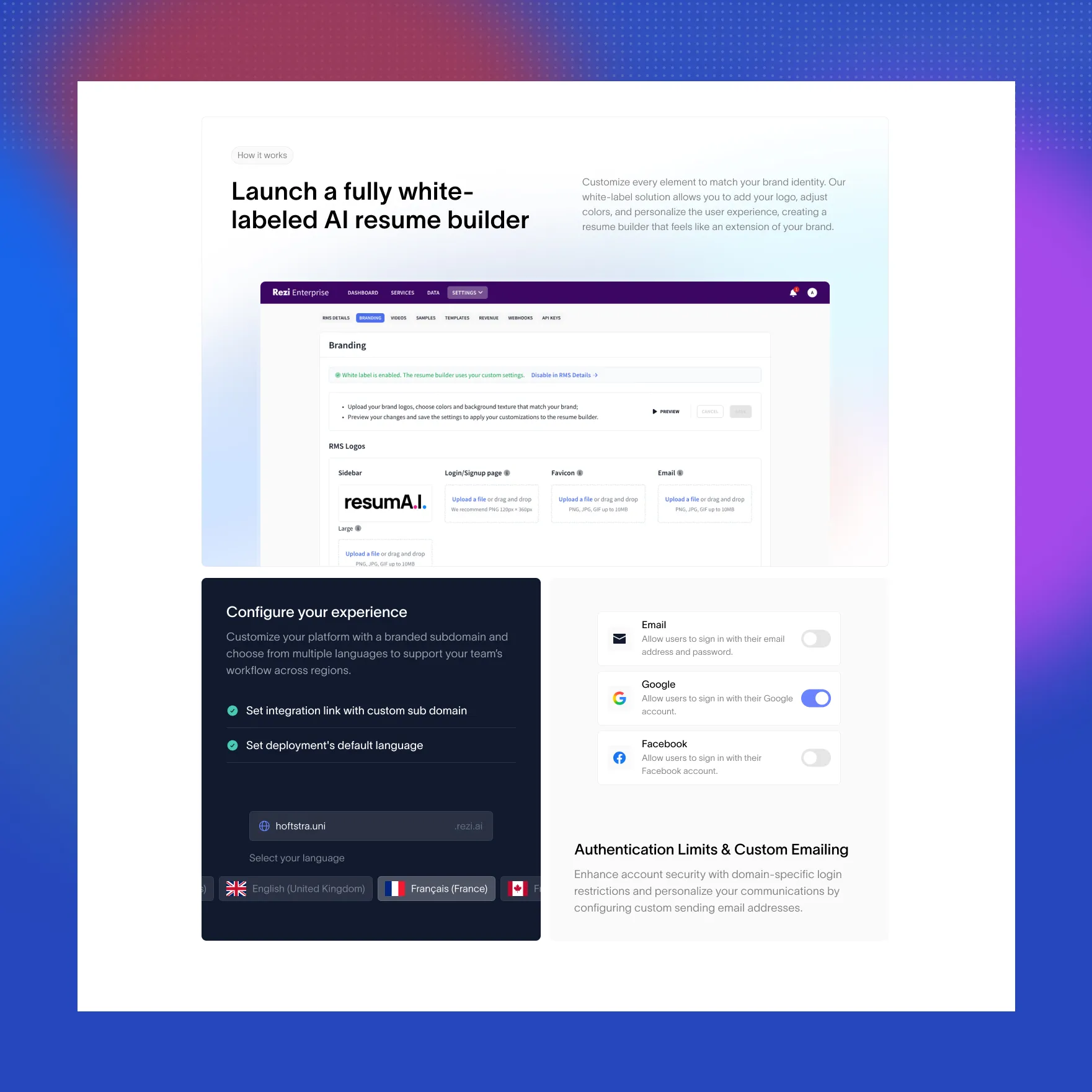
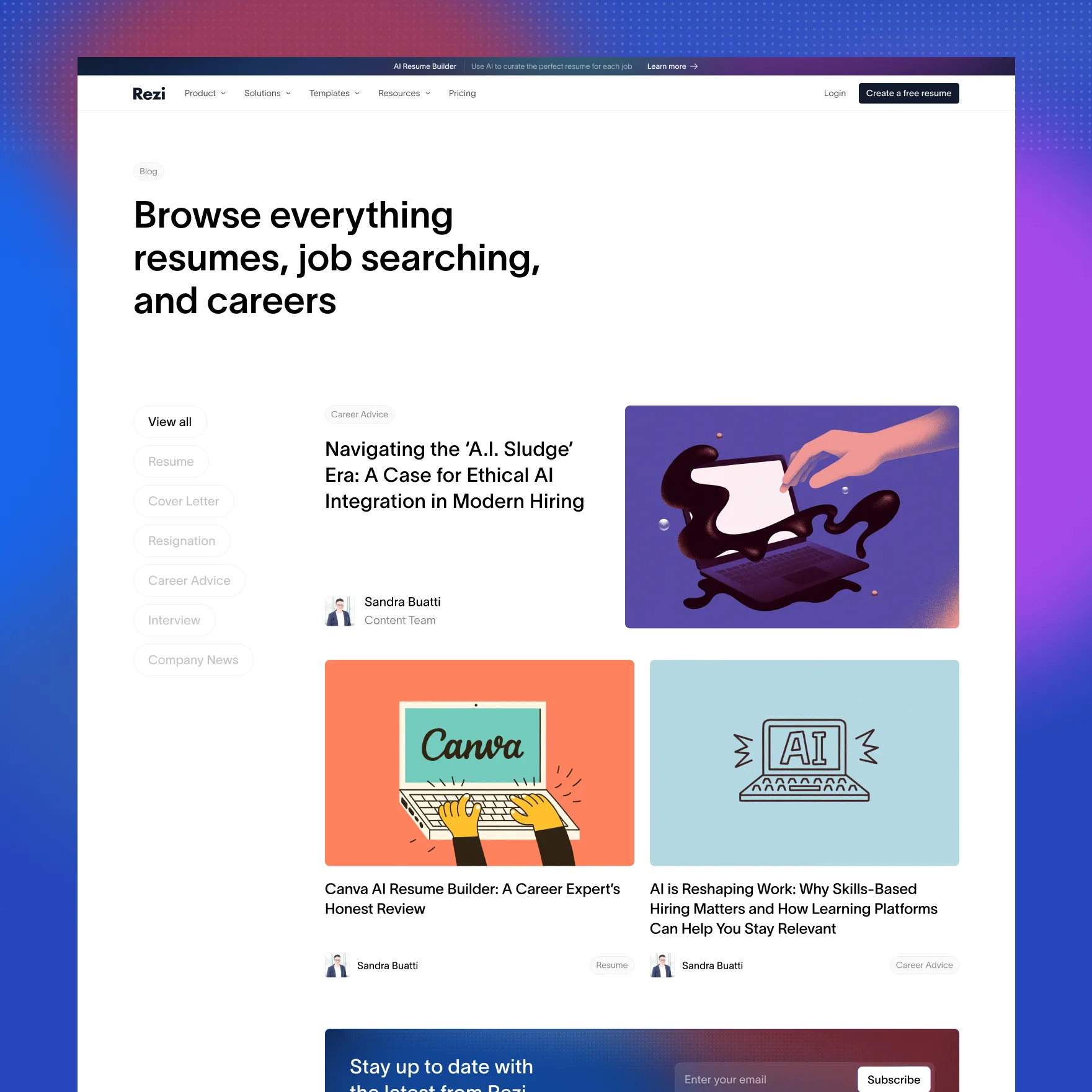
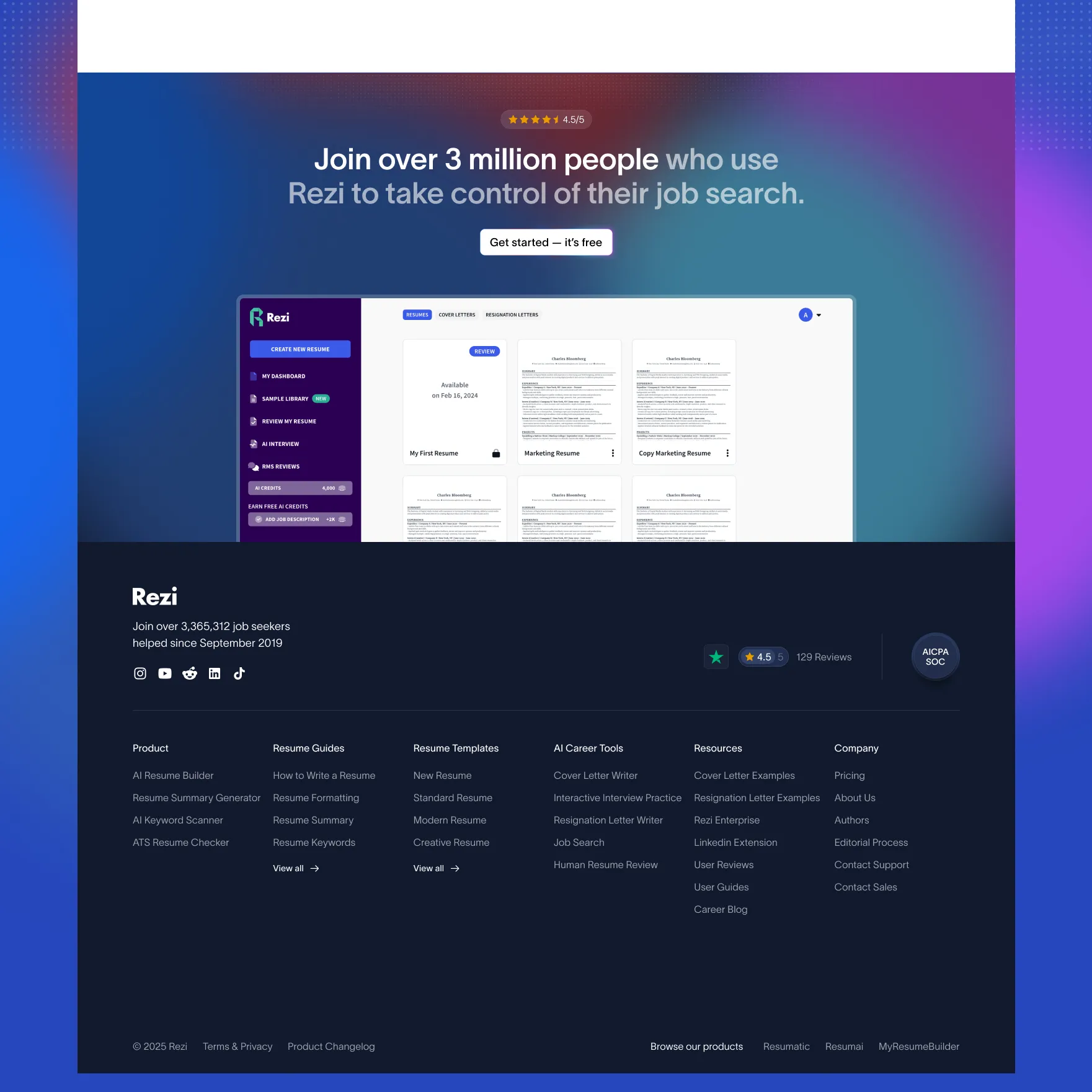
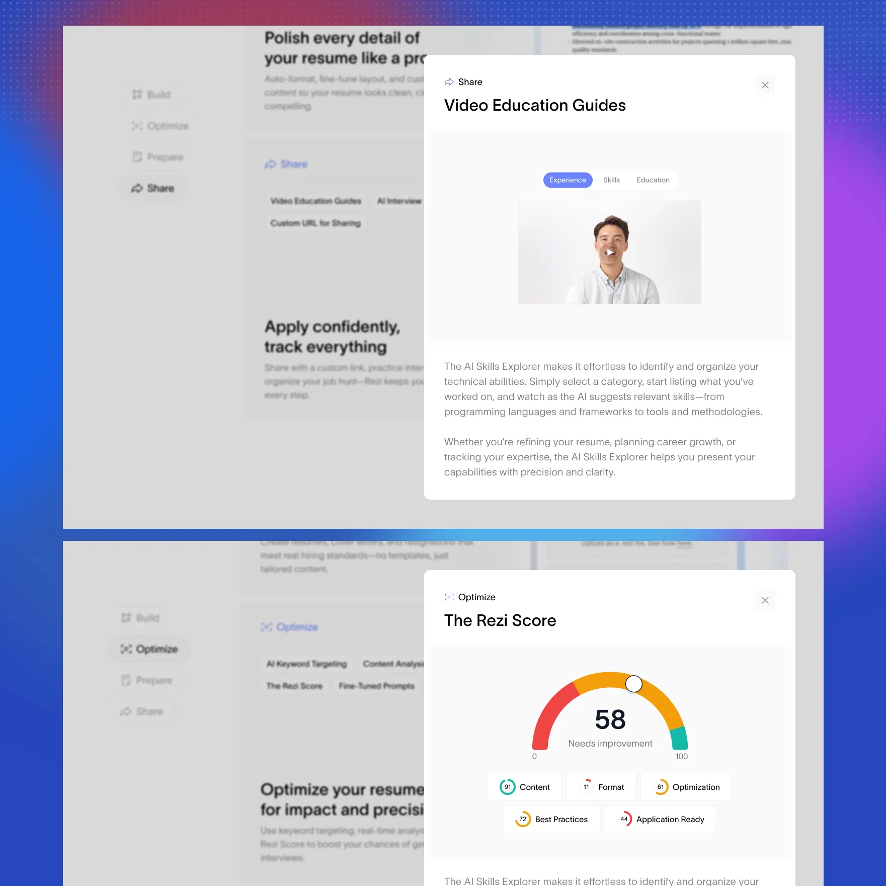
We redesigned Rezi’s website with a sharper, more premium feel — stronger typography, tighter layouts, and a cleaner modern aesthetic that elevates the brand. The goal: build trust, raise credibility, and improve conversions.
Services provided:
Design
Branding


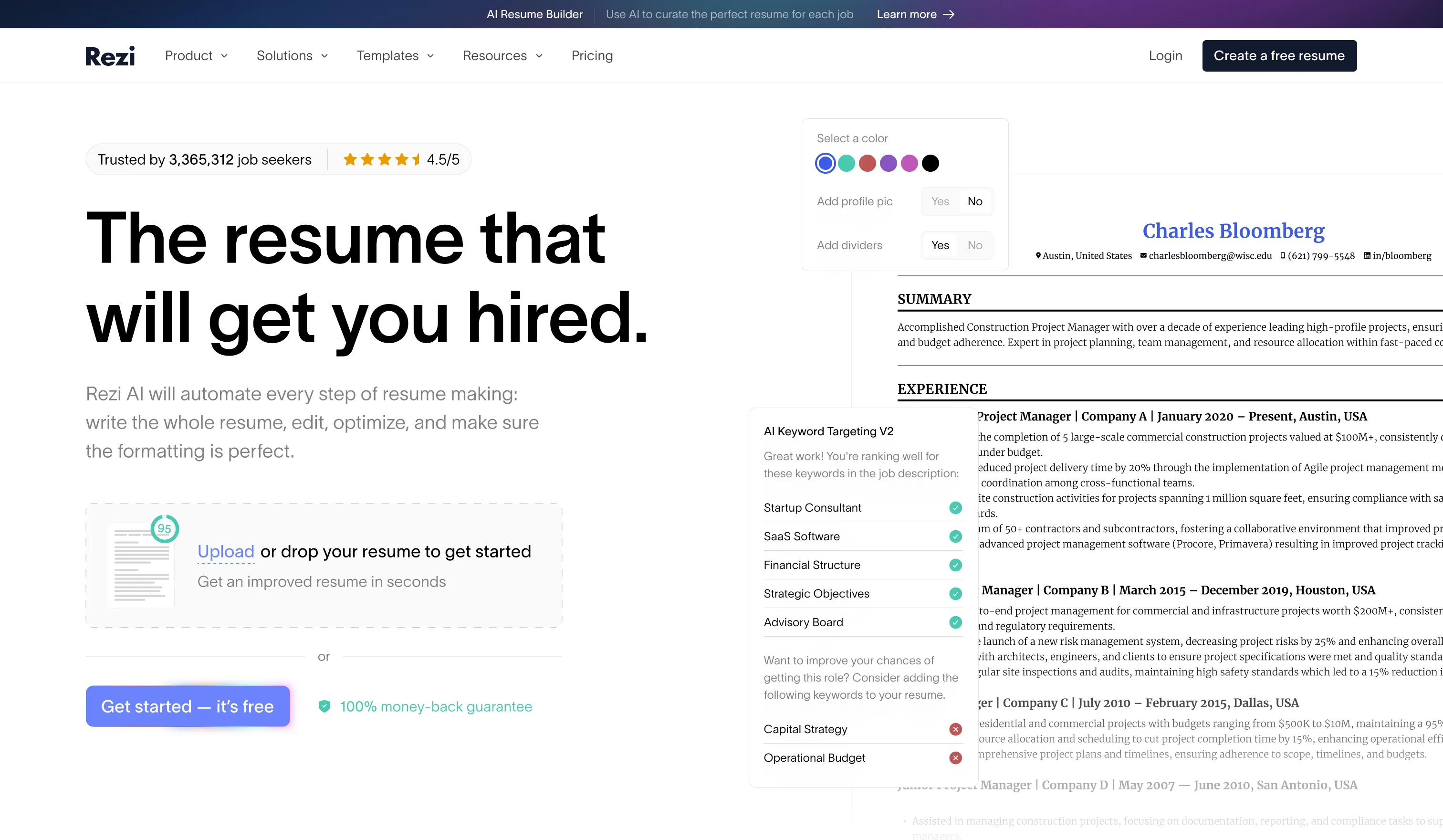
Before
Rezi needed its online presence to reflect a more mature AI product. The existing presentation was not yet conveying the level of polish and confidence the team wanted prospective customers to feel when evaluating the platform.
After
We focused the redesign on typography, visual hierarchy, spacing and page composition rather than adding visual complexity for its own sake. This gave Rezi a more cohesive, premium presentation while keeping product communication central to the experience.
No items found.
No items found.
Let's work!
Oops! Something went wrong while submitting the form.