Why did we change our logo?
Five years ago, our logo was something I quickly made myself. It worked, but it never really represented who we were. A lot has changed since then.
Five years ago, our logo was something I quickly made myself. It worked, but it never really represented who we were. A lot has changed since then.
Five years ago, I needed a logo for ViDesigns. So I made one on Figma. Took a free serif font, tweaked the weight, threw it in a box and called it a day.
There wasn’t a huge strategy behind it. No deep brand workshop. No clever meaning hidden inside the mark. It was a V, obviously because I'm a narcissist, it looked decent, and it did the job.
At the time, that was enough, and it wa enough for a very long time.
But ViDesigns today is a very different company from the one I started at university.
We’ve grown into a team of 10. We work with larger companies, take on more ambitious projects, and our role has expanded far beyond simply designing or developing websites. We now work across strategy, design and development, helping clients figure out what their website needs to do, how it should work and how it can support the wider business.
The old logo no longer represented that.
So as we started reworking our website and broader brand, we ended up asking a pretty simple question...
Does our identity still represent the company we’ve become? The answer was sadly no...
A new logo wasn’t on the roadmap atll. The plan was to refresh the website and sharpen the positioning.
But during that process, our design team took the initiative to explore what a new ViDesigns mark could look like.
And that was probably one of my favourite parts of the whole process.
The original logo was mine. I created it myself and, naturally, I had some attachment to it.
This time, I had to let go. I took a step back and just wanted to see what would happen.
The team owned the exploration, presented concepts and brought me into the process for feedback rather than waiting for me to lead it. That might sound like a small thing, but it felt symbolic to me.
ViDesigns isn’t just me anymore. The brand shouldn’t be either.
We wanted to keep the V. There’s already recognition around it and we didn’t want to throw away five years of brand equity just for the sake of making something new.
Instead, we wanted to give it meaning.
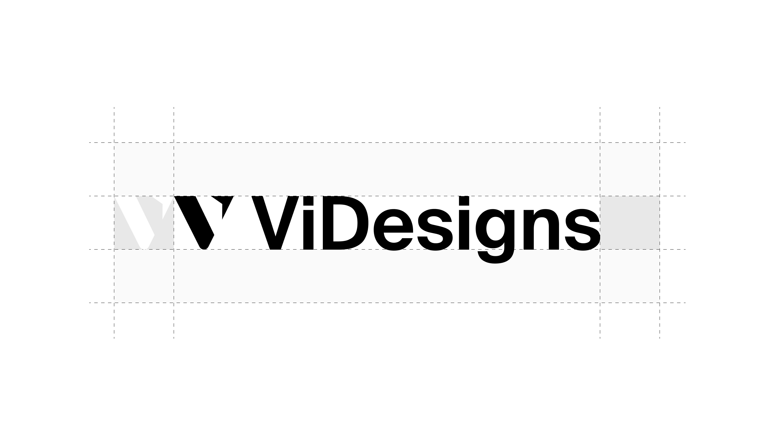
The left side of the mark takes inspiration from the slash you see in code.
It represents the development side of ViDesigns and the technical work that has always been a huge part of what we do.
The right side completes the V with an upward-pointing arrow. There are a few ideas packed into it.
First, it resembles a Figma cursor, representing design.
Second, it points upwards, which reflects the outcome we’re always trying to create for clients: progress.
Better websites. Better conversions. Better systems. Better businesses.
And finally, the shape also feels like a compass.
That represents the strategic side of our work.
We’re not here just to take instructions and build pages. More and more, our job is to help clients navigate what they should build, what matters and how their website needs to evolve.
So within one V, we have development, design, strategy and progress.
That feels a lot closer to ViDesigns today.
One of the big goals behind the wider identity was maturity.
We wanted the brand to feel more premium, more confident and more representative of the level of work we’re producing now. I wanted to look at the logo and feel proud that it represents us.
And for the first time, I really do!
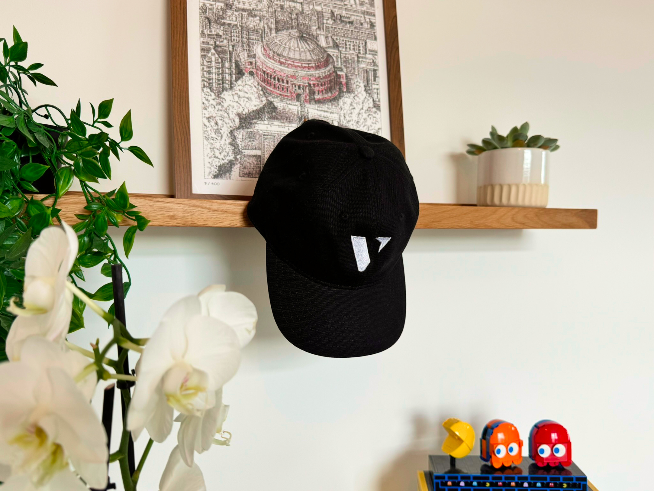
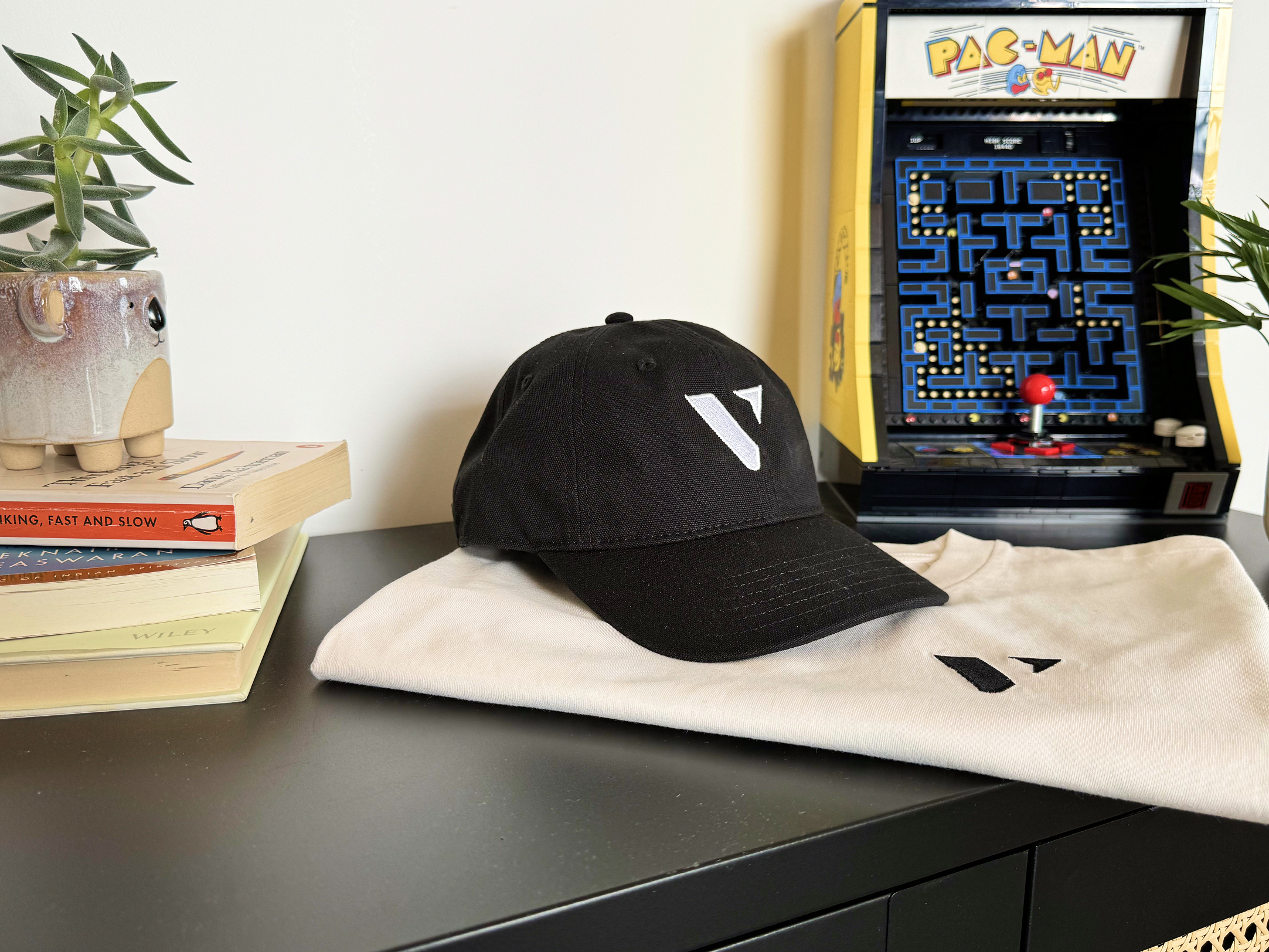
We’ve spent a lot of time sourcing high-quality merchandise for the team and for clients, and seeing the new mark on caps, shirts and bags was probably the point where it properly clicked for me.
It finally felt like something we wanted to put everywhere.
I’ve never really been someone who likes wearing branded clothing. I’ve actually shied away from wearing ViDesigns merch in the past. But this time feels different. For the first time, I look at something with our logo on it and genuinely want to wear it everyday. It feels like something I’m proud to represent.
Unexpectedly, it has also gathered a lot of interest from clients, freelancers, friends and family! That is always a really good sign.
The old ViDesigns logo represented a guy who knew nothing, putting something together so he could get more work. The new one represents a team.
A team that can own an entire website journey from strategy through to design and development.
A team that wants to work on bigger, more ambitious projects.
And a team that cares deeply about the quality of the work without losing the personal side that got us here in the first place.
Five years later, the V is still there. It just means a lot more now.
.webp)