CRESCENT / CASE STUDY
Bringing Crescent’s brand, website and product together.
Crescent needed a sharper brand and a website businesses could trust with significant funds. We created the identity, designed and built the website, then extended the new direction across every screen of its product.
01 / THE PROJECT
A growing business needed a more credible presence.
Crescent helps businesses manage their cash, payments and treasury needs. Its website needed to give prospective customers confidence in both the product and the people behind it.
Introduced to ViDesigns through a referral, the team was looking for quality execution and close attention to detail. Our relationship began with Crescent Cares before extending to Crescent’s main business website, covering branding, website design and Webflow development.
CLIENT
Crescent
INDUSTRY
Business finance / fintech
SERVICES
Brand identity, website design, Webflow development and product design
RELATIONSHIP
Crescent Cares → Crescent
02 / THE CHALLENGE
When you’re asking businesses to move their money, every detail matters.
The existing website no longer reflected the business Crescent had become. The new identity needed to feel sharp, established and trustworthy, while retaining the character of a modern financial product. That meant looking beyond familiar SaaS and fintech styling. Crescent’s audience needed something tangible: a clear sense of the product, how it worked and why they should feel comfortable using it.
01 / CREDIBILITY
Build credibility through brand and design.
Create a distinctive brand that feels considered and dependable to businesses making significant financial decisions.
02 / PRODUCT
Make the product easier to understand.
Explain financial features and benefits visually, without filling every section with dense dashboard screenshots.
03 / COMPLIANCE
Give compliance room to breathe.
Accommodate detailed disclosures while keeping the page hierarchy clear and the website approachable.
03 / BEFORE & AFTER
Closing the gap between the business and its website.
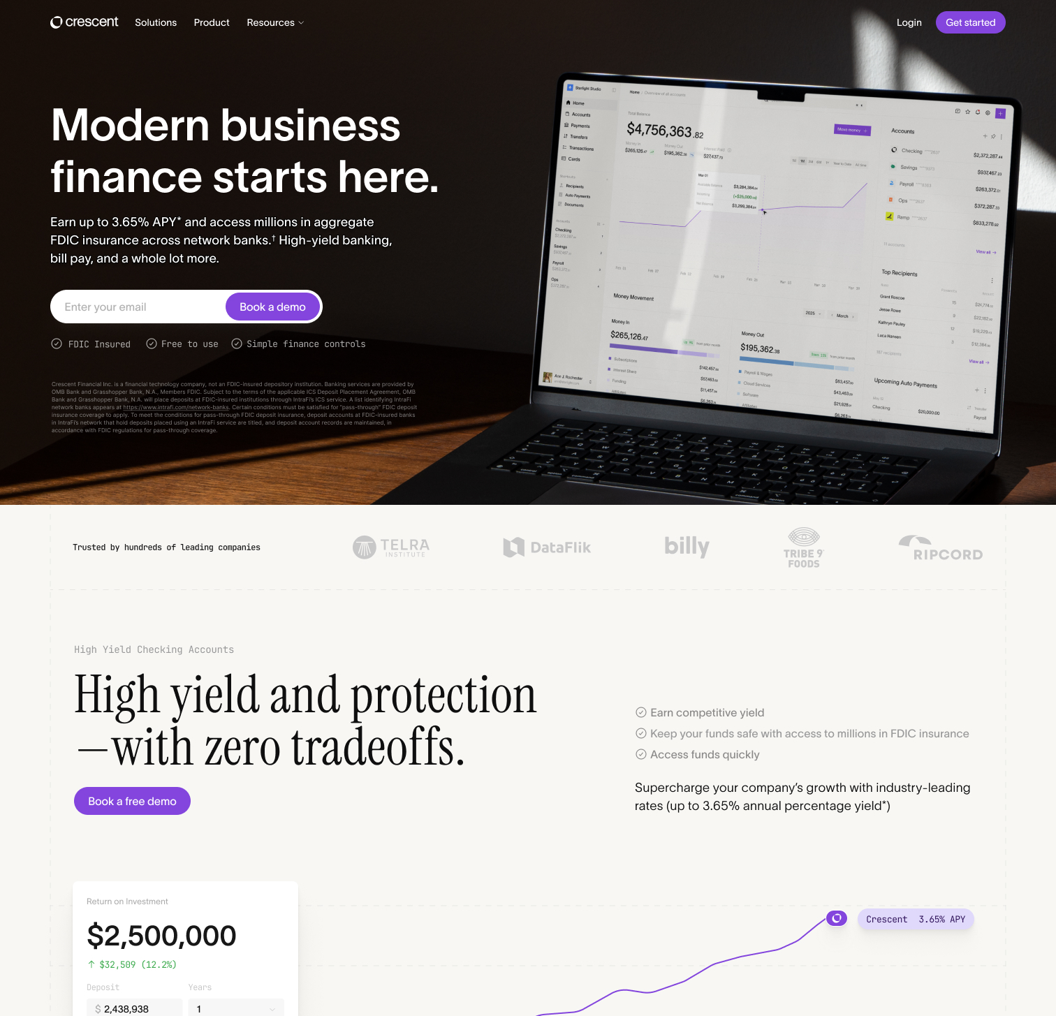
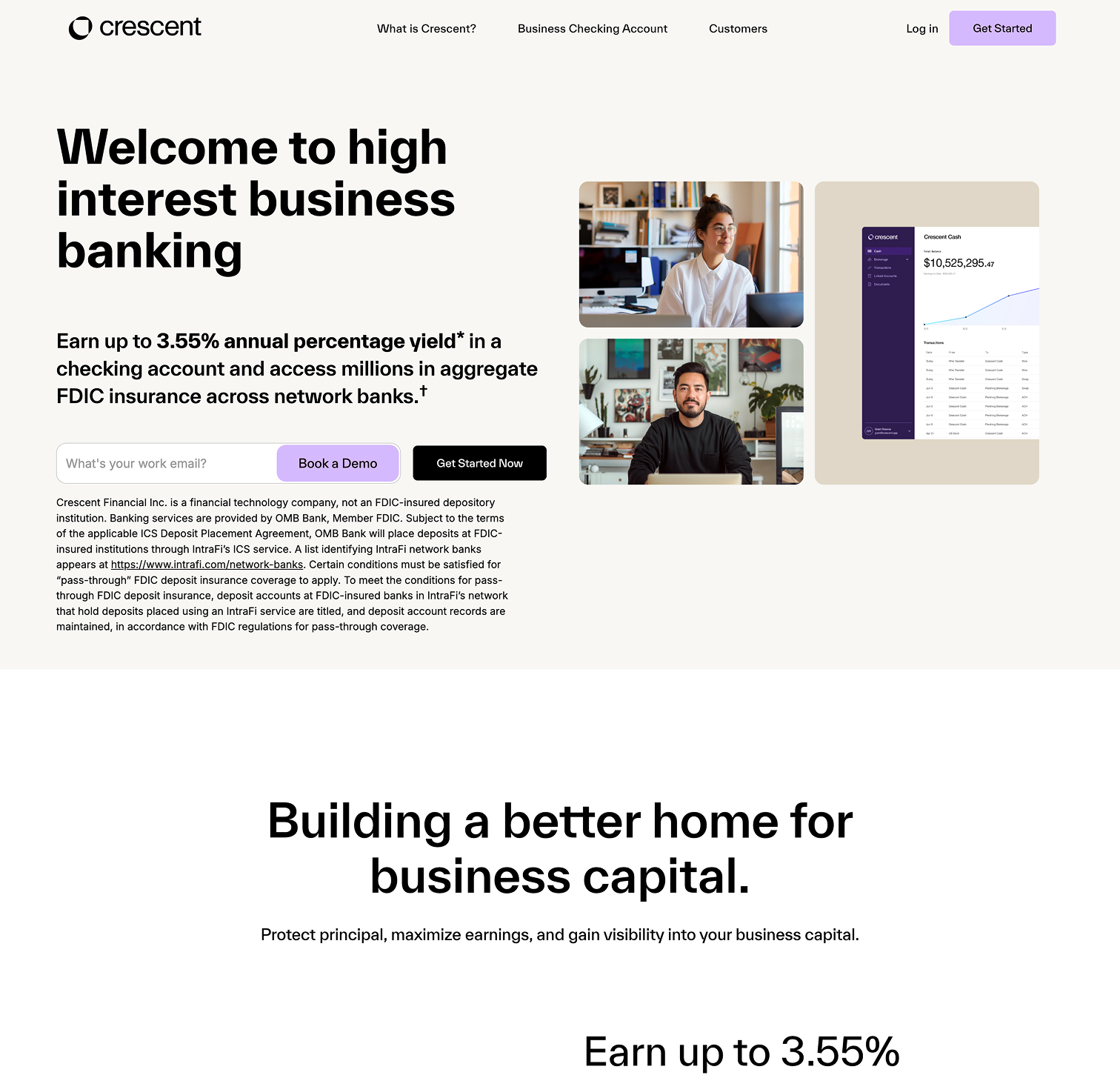
Crescent had grown, but its website no longer reflected the quality of the business behind it. We replaced that presence with a new identity and a more polished website, giving the product a clearer introduction and the brand a more consistent expression.
04 / BRAND IDENTITY
A new identity for the business Crescent had become.
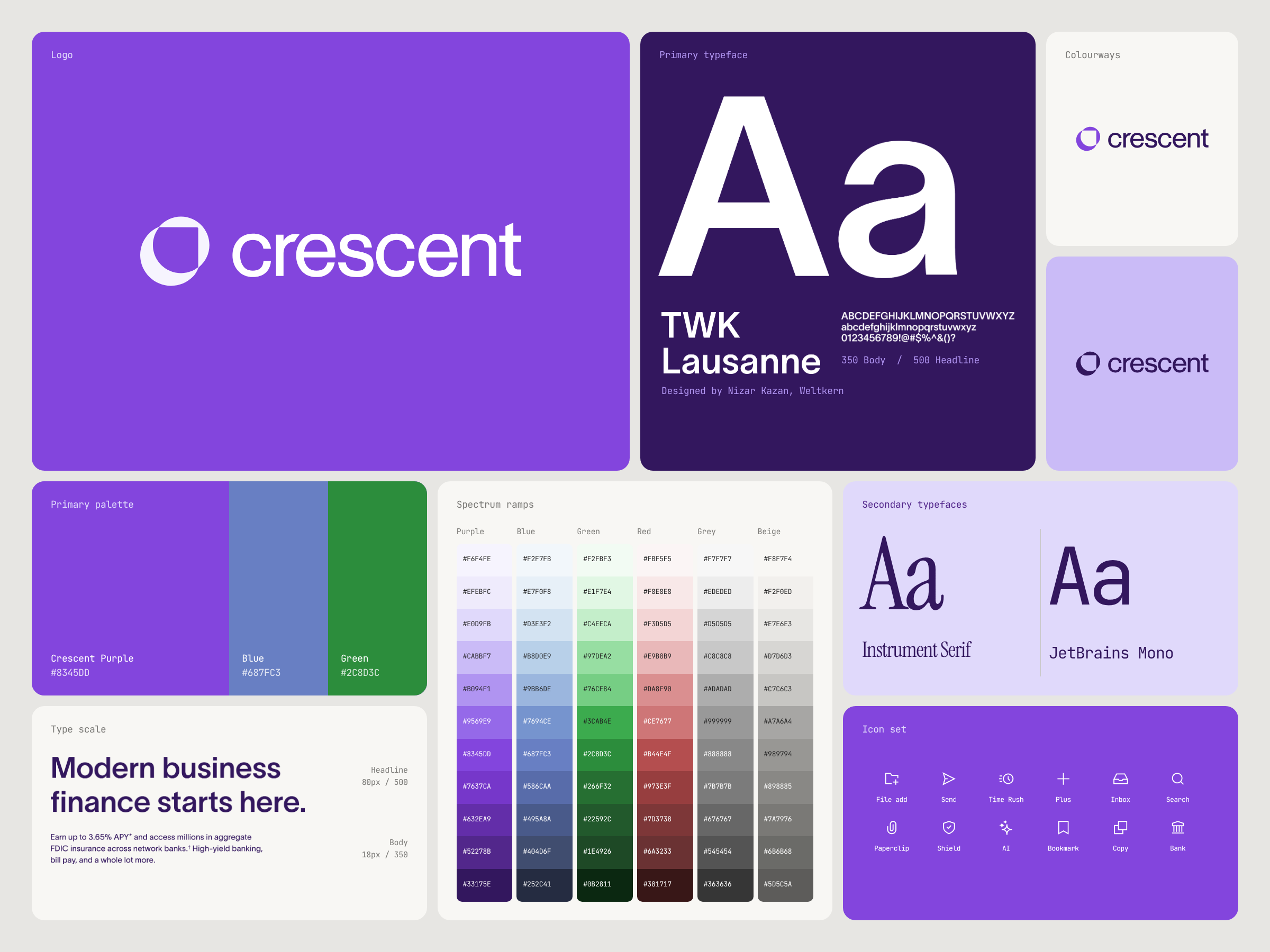
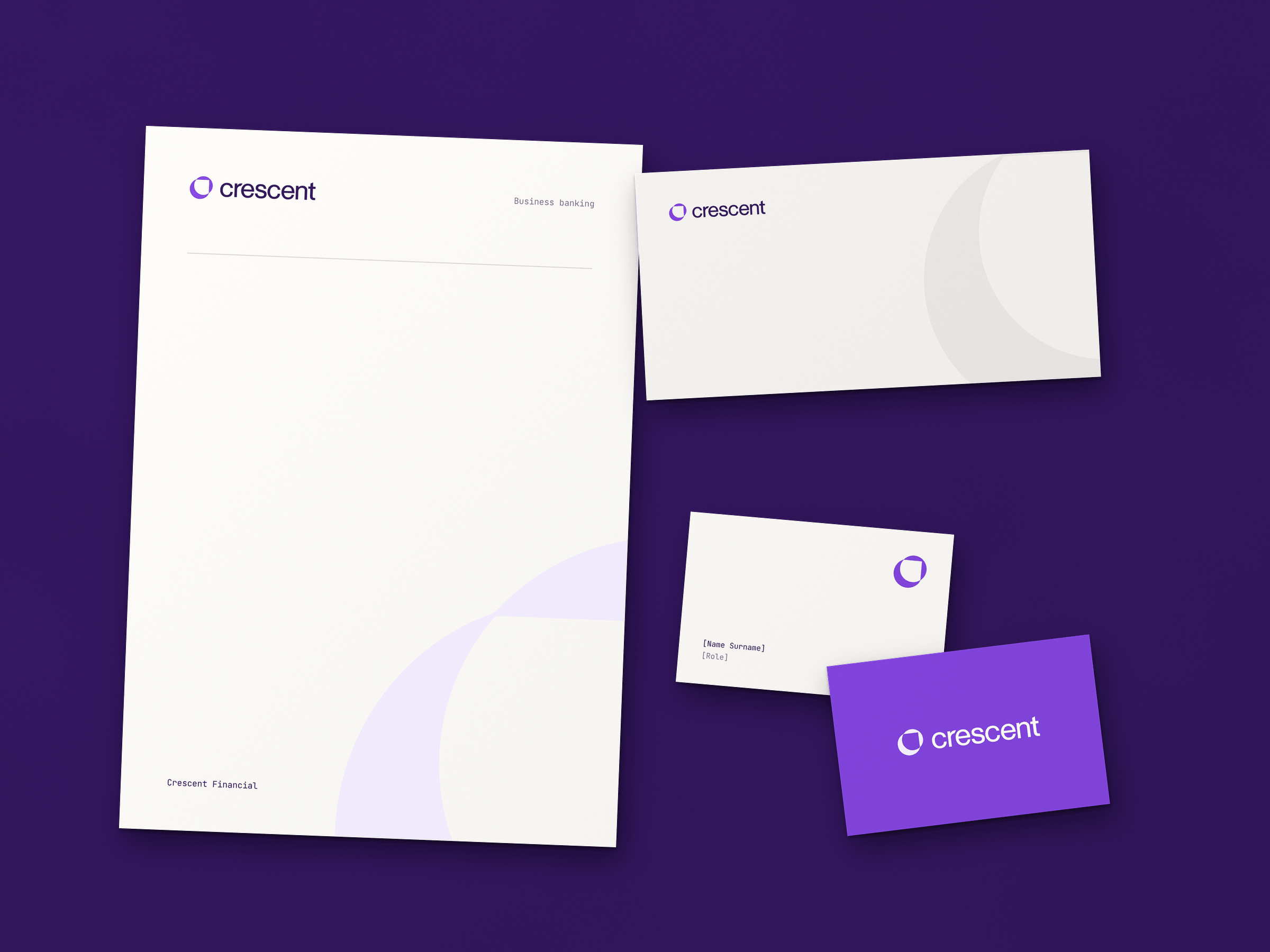
Crescent needed a brand that felt premium, sharp and dependable, with enough personality to stand apart. Its customers were making serious decisions about their business finances. The identity had to feel established and tangible, while giving Crescent a visual system it could grow with.
We developed the complete identity and brand guidelines, defining the logo, colour palette, typography and supporting visual language. Expressive purple gives the brand a distinctive signature, while neutral backgrounds and a mix of sans-serif and serif typography balance modernity with a more established feel.
The guidelines brought these choices into one system, giving Crescent a consistent foundation for its marketing and, later, the product itself.
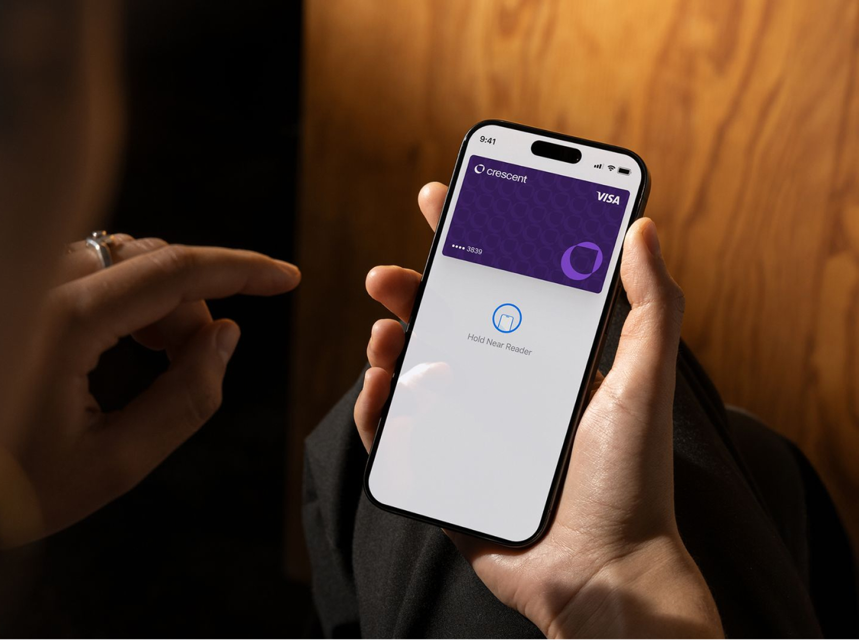
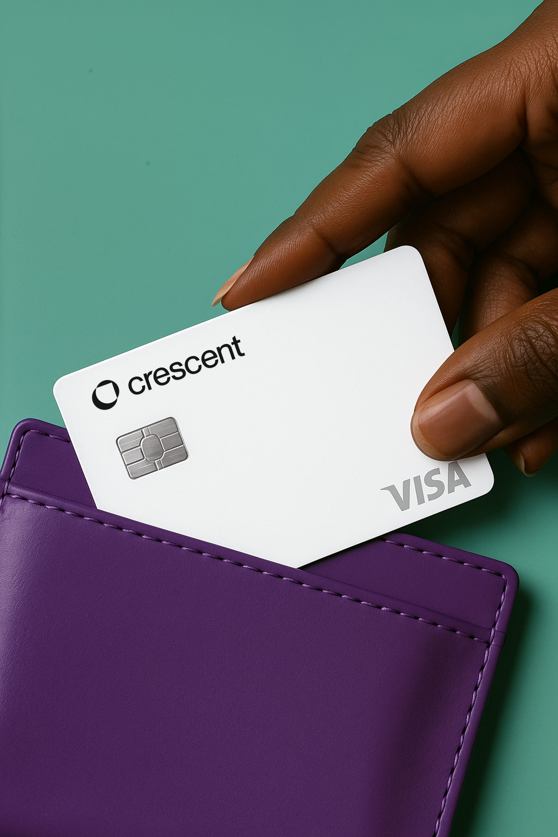
We also extended the branding into the physical world with their corporate card designs, posters, banners and event collaterals.


05 / WEBSITE DESIGN
Making a financial product feel real.
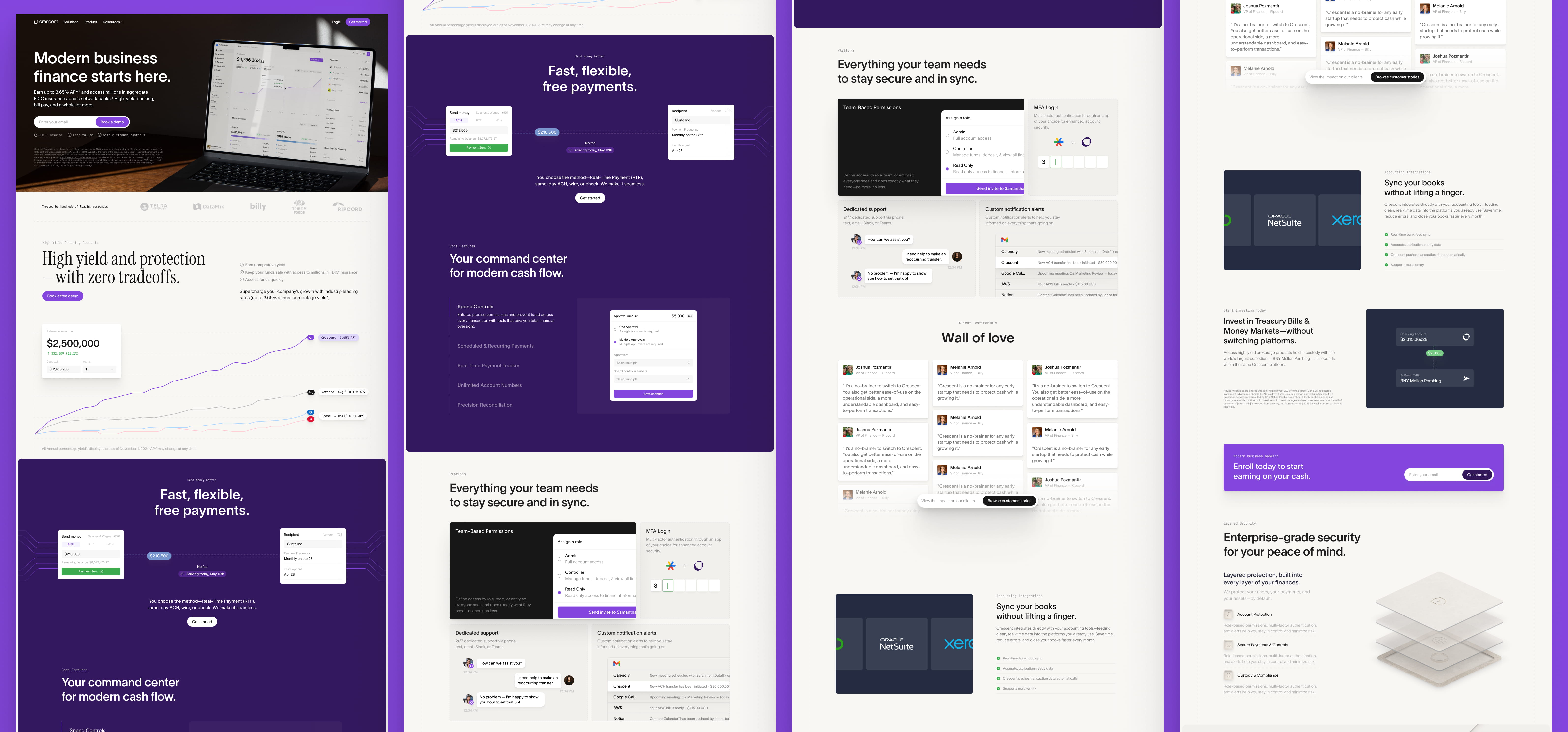
We brought the identity into a website designed to give prospective customers a clear sense of the product. Device mockups placed Crescent in a recognisable working context, helping visitors picture it as part of their business. For individual features, we combined selected interface details with abstract visual explanations. Each section focused on the benefit being communicated, rather than relying on another full dashboard screenshot.
You're going places. Let’s make sure your brand keeps up
We take on a limited number of website projects each quarter so every client gets the time, attention and expertise their website deserves. Get in touch to discuss your project.